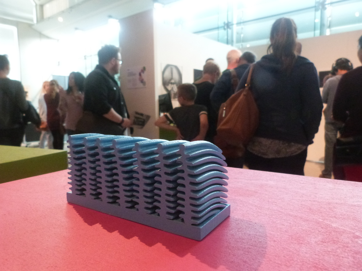
Iridescence: five 3D print outs of ‘photonic structures’ from the butterfly Morpho aurora, mounted on coloured plinths, Millennium Gallery, Sheffield.
If one says ‘Red’ (the name of a colour)
and there are 50 people listening,
it can be expected that there will be 50 reds in their minds.
And one can be sure that all these reds will be very different.
Josef Albers The Interaction of Colour (1963)
This is a rather complex post but I hope that you will bear with me to the end; I think that the journey I have taken through the ‘visible spectrum’ of colour models may have revealed something profound …
I had a meeting with Professor Richard Jones a few days ago. The aim was to discuss possibilities for further development of the ideas that I have had since the beginning of my residency, and some fresh ideas that have grown out of my recent visit to the ESRF in Grenoble.
When I had finished updating Richard with these ideas, he mentioned some thoughts that he had been having about the origins of colour vision in mammals, and how these thoughts might address the problem of chromatic aberration. Chromatic aberration occurs when the wavelengths of light generating colour are ‘smeared’ by the lens, and by the aqueous internal environment of the eye, before they reach the receptor cells on the retina. He told me about how hard the brain needs to work in order to process this compromised information – about how colour is more of a mental construct than we might think; how colour is, in fact, a kind of epiphenomenon.
An epiphenomenon, in simple terms, is a secondary phenomenon that occurs alongside or in parallel to a primary cause (i.e. wavelengths of light might be the cause of colour, but the sensation of colour is an epiphenomenon).
This thought resonated in my mind with some of the complex issues that I have faced whilst creating five coloured objects representing the structures that create iridescent colour in butterflies; in this case from the wings of Morpho aurora.
Creating the 3D prints was, thankfully, done for me – I didn’t have to carve them out of wood or wax – instead, a series of scanned images taken from two different axes, were fed into a MakerBot and the machine then wove the models out of nylon thread. The difficult part, for me, was the issue of representing the colours.
Some time ago I was presented with a series of CMYK values by Adam Washington, a member of Richard’s research group. The CMYK color model is a subtractive colour model, operating on a basis that is similar to pigments, that is used in colour printing. CMYK refers to cyan, magenta, yellow and key (black): the four coloured inks that printers use. The CMYK values that Adam provided me with were, in essence, a four colour numerical coding of the colours perceived by eye when viewing the structures in the butterfly wing from various angles. It is through changes in these relative angles that we perceive the alteration in colour that creates the phenomenon (or epiphenomenon) of iridescence.
Adam had sent me the code for 28 angles in total – from -3.0° t0 24°.
The numerical values for each angle looked something like this:
Angle -3.0°
C 0.00%
M 23.50%
Y 38.20%
K 86.70%
As you can see the K (key or black value) was 86.70% which meant that when I brought these values into a shape within my graphics programme it produced a four colour (CMYK) hue dominated by back. In fact to all intents and purposes we had produced a black shape … it was apparent that we needed to filter out the black in order to perceive the bright hues that we had hoped for.
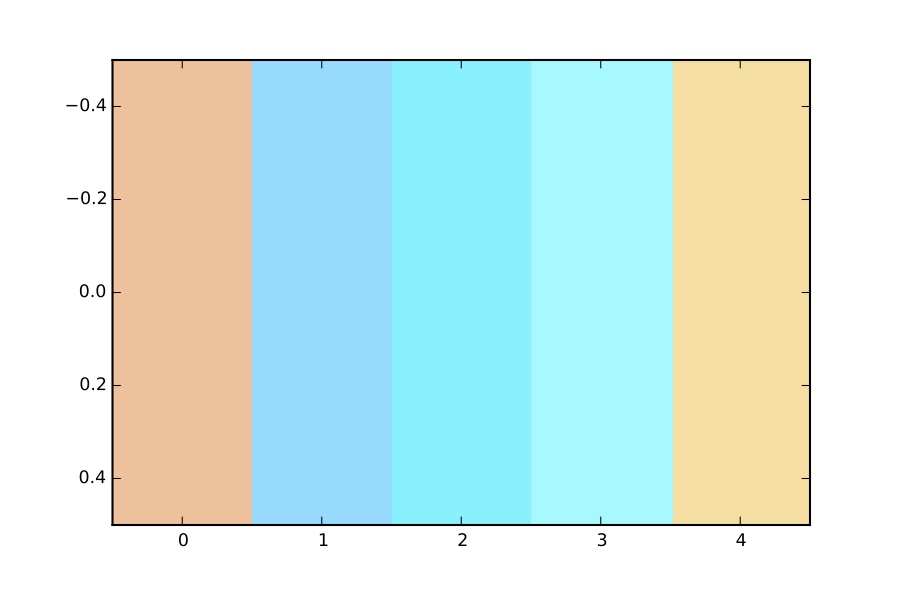
We chose five angles to represent five distinct stages from the full range of Morpho iridescence, and then Adam adjusted the data to increase the brightness. Here’s what he came up with:
Brighter version of the CMYK values (jpg image converted from PDF).
Of course what you are looking at now is most likely an RGB representation on some sort of screen (unless you have taken the trouble to print this out, in which case I thank you!). By contrast to the subtractive CMYK colour model, The RGB color model that governs the colours that you see on a screen or through a projector is an additive colour model in which red, green and blue light are added together in various ways to reproduce a broad array of colours. In this case the name of the model comes from the initials of the three additive primary colours, red, green and blue.
So, we have moved from a coded form of numerical values, derived from structural colour, to CMYK (subtractive colour) to RGB (additive colour) – what might have been lost in translation?
The answer is: quite a lot, as the next stage in this process of translation/transliteration proved. When I printed out the PDF that Adam had supplied me with, the colours were not even close to what I had seen on my computer screen … taken from the left, the peachy colour (0 in the image above) was closer to a salmon pink, the blue that sits next to it (1) is not too bad a match but the central, cyan, colour is all wrong – a dark blue in the print out – closer to Cobalt blue if I were to compare it to a paint. The greenish blue (3) – or is it a green? – in the image above has printed out as a lighter version of (1) and the ochre colour (4) is closer to a sandy yellow.
Note the quote by Joseph Albers above – I am now using forms of words to compare what I saw in the print out that I held in my hand with the image that you see above on your screen. When I talk about ‘the ochre colour’ (4) are you thinking about the same ‘ochre colour’ as me? This speculation reinforces Richard’s comment above – how colour is, in fact, a kind of epiphenomenon.
Now bear in mind the route through the optical pathway that generates the sensation of a colour: photons of light enter the eye through the cornea and are directed onto the retina by the lens (at this point they are passing through the aqueous humour – essentially a slightly squashed spherical container of water), once they reach the retina each photon reacts with the pigment in an individual cone cell or colour receptor. This in turn triggers a chain of neural connections through the grey matter of the brain until it reaches the area specifically allocated to process this particular form of sense-data. Only then does it become colour – through a process of material/energy transformation from particles/wavelengths of light into pigments, into electrical discharges and then into, well, part of a perceived image – part of consciousness! As with all sensory information, vision is virtual experience, a secondary phenomenon that occurs alongside or in parallel to a primary cause, an epiphenomenon.
So, then, just how real is colour?
In the end I decided to match my colours for the 5 x 3D prints from the PDF on my computer screen. I think that the approximation achieved is just that: an approximation. To me this seems to fill both definitions of a simulacrum – the colours (and objects) constitute both an image of something and a (possibly unsatisfactory) substitute.
The simulacrum has long been of interest to philosophers. In his Sophist, Plato speaks of two kinds of image making. The first is a faithful reproduction, attempted to precisely copy the original. The second is intentionally distorted in order to make the copy appear correct to viewers. He gives the example of Greek statuary, which was crafted larger on the top than on the bottom so that viewers on the ground would see it correctly. If they could view it in scale, they would realize it was malformed. This example from the visual arts serves as a metaphor for the philosophical arts and the tendency of some philosophers to distort truth so that it appears accurate unless viewed from the proper angle.
In the ‘simulacrum’ above, a series of five colours are presented on the surfaces of five hugely enlarged photonic structures – an approximation of reality that has come into being through a layered process of mutating colour models. It began life as a structure within a butterfly’s wing, became a set of numerical values approximating angular interferences in the wavelengths of light, then became the product of an additive process on a computer screen and was finally converted into pigments.
Nietzsche addresses the concept of simulacrum (but does not use the term) in the Twilight of the Idols, suggesting that most philosophers, by ignoring the reliable input of their senses and resorting to the constructs of language and reason, arrive at a distorted copy of reality.
Now, look at this image of a 3D printed, painted structure from a butterfly wing – is the blue that you see the same as the blue that I see?