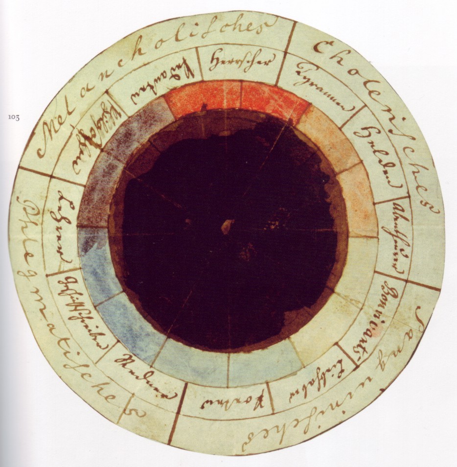
The “rose of temperaments” (Temperamentenrose), an early study (1798/9) by Goethe and Schiller, matching twelve colours to human occupations or their character traits (tyrants, heroes, adventurers, hedonists, lovers, poets, public speakers, historians, teachers, philosophers, pedants, rulers), grouped in the four temperaments.
The blackest black, the whitest white, the bluest blue, the reddest red, all trip off the tongue quite easily. Any of these superlatives might summon up an abstract image of such a colour, perhaps derived from some form of synesthesia – an occurrence within the brain’s ‘inner model’; but how about the greenest green, or the yellowest yellow*, the orangest orange* or the purplest purple*, maybe not so much? Not only are these colours harder to imagine, but they also sound physically awkward, as if this simple concept of purity of hue is being warped out of shape – bent beyond verbal recognition.
Anyway, let’s park this question for a little while and begin with some background to this project.
It all began back in late 2014 when I found myself in conversation with Professor Richard Jones regarding the blackest black. I had learned of a substance called Vantablack that had recently been developed by nano-scientists, originally by the National Physical Laboratory and subsequently by Surrey NanoSystems.
Vantablack, whose name is derived from the term Vertically Aligned NanoTube Arrays, is a substance made of carbon nanotubesand is the blackest substance known, absorbing a maximum of 99.965% of radiation in the visible spectrum.It is composed of a forest of vertical tubes which are “grown”. When light strikes Vantablack, instead of bouncing off, it becomes trapped and is continually deflected between the tubes before eventually becoming heat.
The very fact that this substance exists became a source of fascination to me, and I wondered if Richard, with his expertise in nanotechnology, might help me find a way to work with this substance – or with something similar.
I have always seen painting as an essential part of my practise but at the time of this conversation I had been increasingly working on a variety of collaborative projects with the aim of gaining a greater understanding of (or at least investigating) the complex field of relationships between the human animal and nature; investigations at the cultural/biological interface. These creative projects, which often included elements of drawing or animation, but rarely painting, were (and continue to be) very much influenced by ideas from post humanism and, in particular, by some gleanings from the writings of Donna Haraway – attempts to throw some light on what Haraway refers to as the ‘complex, knotted intermeshing that exists between ourselves and other species’.
“We do not have to understand black, it is the primeval ground.”
Paul Klee
But, returning to the primary role of painting in my artistic practice, and thinking about Vantablack from the point of view of a painter, it’s not hard to see why the idea of the blackest black was so incredibly enticing. The idea goes deep, summons forth notions of the sublime as expressed by the philosopher Immanuel Kant: the sublime as a concept more infinite than beauty, found even in an object that has no form – or perhaps an object existing where there is no light by which to determine its form?
Imagine an immense, bitterly cold object that exists in some sightless interstellar void, well out of the reach of light.
That might be a sublime object.
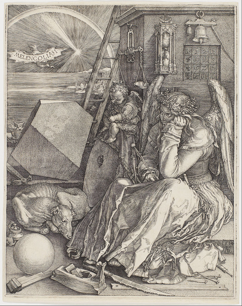
Albrecht Dürer, Melencolia I, 1514, engraving, 24 cm × 18.8 cm
Of course an absence of light can also occur in the mind; and the colour black is deeply associated with melancholia. The name “melancholia” comes from the old medical belief in the four humours: that a disease was caused by an imbalance in one or other of the four basic bodily liquids: blood, black bile, yellow bile and phlegm. Personality types were determined by the dominant humour in a particular person; melancholia was associated with black bile.
During the later 16th and early 17th centuries, a curious cultural and literary cult of melancholia arose in England. In an influential 1964 essay in Apollo, art historian Roy Strong traced the origins of this fashionable melancholy to the thought of the popular Neoplatonist and humanist Marsilio Ficino (1433–1499), who replaced the medieval notion of melancholia with something new:
Ficino transformed what had hitherto been regarded as the most calamitous of all the humours into the mark of genius. Small wonder that eventually the attitudes of melancholy soon became an indispensable adjunct to all those with artistic or intellectual pretensions.
The Anatomy of Melancholy (The Anatomy of Melancholy, What it is: With all the Kinds, Causes, Symptomes, Prognostickes, and Several Cures of it… Philosophically, Medicinally, Historically, Opened and Cut Up) by Robert Burton, first published in 1621, remains a defining literary monument to the fashion.
In the work above by Albrecht Dürer, it has been suggested that the “I” refers not to the position of the engraving in a series, but to the first of the three types of melancholia defined by the German humanist writer Cornelius Agrippa. In this type, Melencholia Imaginativa, which he held artists to be subject to, ‘imagination’ predominates over ‘mind’ or ‘reason’. Iván Fenyő considered the print a representation of the artist beset by a loss of confidence, saying:
“shortly before [Dürer] drew Melancholy, he wrote: ‘what is beautiful I do not know’ … Melancholy is a lyric confession, the self-conscious introspection of the Renaissance artist, unprecedented in northern art. Erwin Panofsky is right in considering this admirable plate the spiritual self-portrait of Dürer.”
In the 20th century, much of the counterculture of modernism was fueled by comparable alienation and a sense of purposelessness called “anomie”; earlier artistic preoccupation with death has gone under the rubric of memento mori. The medieval condition of acedia (acedie in English) and the Romantic Weltschmerz were similar concepts, most likely to affect the intellectual.
Dürer’s etching includes a mysterious ‘magic square’ believed to be the first seen in European art. It is very similar to Yang Hui‘s square, which was created in China about 250 years before Dürer’s time. The exact meaning of this square has been the source of much speculation.
The Russian artist Kazimir Malevich painted a mysterious black square very early on in the last century; another square that resists definite interpretation. On the Tate website Fiontan Moran lists five ways in which to view this – including the following: as the first time that someone made a painting that wasn’t of something; as a revolutionary symbol, or as non-specific icon …
Returning to our consideration of the sublime object and its potential formlessness, we have to admit that this painting is definitely square in form (i.e. it is not formless); but it is a painting that might be approaching an ideal state, the kind of ‘ideal form’ that Plato might have recognised thousands of years before: As Malevich states: ‘In the year 1913, trying desperately to free art from the dead weight of the real world, I took refuge in the form of the square.’
Kazimir Malevich, 1915, Black Square, oil on linen canvas, 79.5 x 79.5 cm, Tretyakov Gallery, Moscow.
Unfortunately reality has not been kind to this relict of modernist idealism from another time – it has worked its oxidising effects on the varnish that overlays the paint, wrinkling and cracking the painting’s skin with age. It has become an all too human object … in fact there is something of the abject about the current state of Black Square; the concept of the abject forming another element in the constellation of ideas that circulate around the dark heart of the sublime …
After Richard and I had this conversation about Vantablack, I went away in a state of some excitement …
But then I read in a newspaper that Sir Anish Kapoor (CBE RA) had been in discussion with Surrey NanoSystems and that he would be working with Vantablack. Although this was very disappointing, not to say depressing, it came as no surprise. I was well acquainted with Kapoor’s explorations into the sublime qualities of colour and form – not to mention the powerful cultural, mythic and symbolic associations that he draws upon in his practise, and which he uses the arcane language of pure colour to transmit. But the blackest black might absorb even the brightest spark of artistic inspiration … ‘What is beautiful I do not know’ [Dürer, quoted by Iván Fenyő – see above] when seized with the melancholy of self-conscious artistic introspection, or perhaps when faced with the terrifying void of the blank page, or canvas.**
“The eye takes its first bearings from quantitative differences of illumination, and in their absence feels most at loss. Black and white offers the extreme statement of these differences.”
Clement Greenberg
Then I had another discussion with Richard – this time about white, about the whitest white. Apparently he and his research group were working on a structural colour approach to creating a substance with such a quality. So maybe all was not lost. If I could work with the whitest white and also the blackest black then how about considering the possibility of working with a whole spectrum of the purest hues?
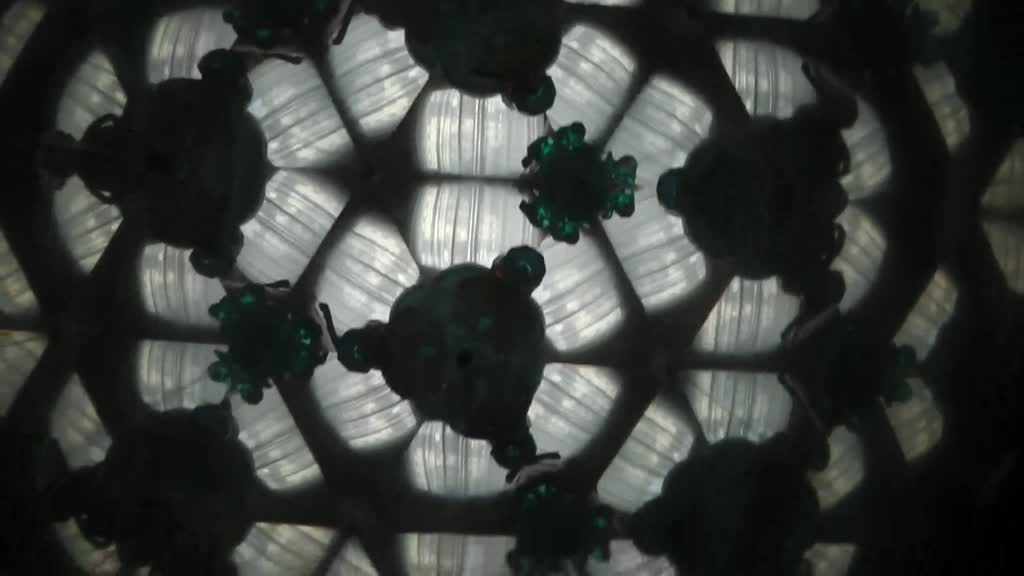
View inside a kaleidoscope.
A kaleidoscope is a cylinder with mirrors containing loose, colored objects such as beads or pebbles and bits of glass. As the viewer looks into one end, light entering the other end creates a colorful pattern, due to the reflection of the mirrors. It is a device that bears comparison to the natural devices of structural colour. Coined in 1817 by Scottish inventor Sir David Brewster,”kaleidoscope” is derived from the Ancient Greek καλός (kalos), “beautiful, beauty”, εἶδος (eidos), “that which is seen: form, shape” and σκοπέω (skopeō), “to look to, to examine”, hence “observation of beautiful forms.”
It appears that I have already moved away from the blackest black, from a substance that sucks in the greatest amount of light. I have moved to a kaleidoscopic ‘beauty that can be observed’ – away from the dark heart of the sublime and away from melancholia.
But what about those other superlative colours that I mentioned in the question at the start of this blog? I’m not sure if all of the colours – for which we have names – have the same depth of cultural associations as ‘black’ (there are only three other humours for example), but I think that the bluest blue might be worth examining next:
As yellow is always accompanied with light, so it may be said that blue still brings a principle of darkness with it. This color has a peculiar and almost indescribable effect on the eye. As a hue it is powerful — but it is on the negative side, and in its highest purity is, as it were, a stimulating negation. Its appearance, then, is a kind of contradiction between excitement and repose. As the upper sky and distant mountains appear blue, so a blue surface seems to retire from us. But as we readily follow an agreeable object that flies from us, so we love to contemplate blue — not because it advances to us, but because it draws us after it. Blue gives us an impression of cold, and thus, again, reminds us of shade. We have before spoken of its affinity with black. Rooms which are hung with pure blue, appear in some degree larger, but at the same time empty and cold. The appearance of objects seen through a blue glass is gloomy and melancholy. When blue partakes in some degree of the plus side, the effect is not disagreeable. Sea-green is rather a pleasing colour.
Johann Wolfgang von Goethe
A theory of Colours
*In fact the last three of these superlatives got questioned when I ran a spell check – but only the last three …
** Since then Sir Anish Kapoor (CBE RA) has been given exclusive rights to the use of Vantablack by Surrey NanoSystems – a source of some controversy.
Although the story is not over yet – researchers in Saudi Arabia have claimed to have recently discovered an even darker nanomaterial.